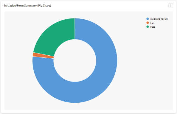
Pie charts are a useful way to be able to report off on one piece of data - for example, the number of risks within your organisation by score (e.g. Low, Medium, High, Critical), or the number of operational controls within your organisation by current implementation status. In this example, we will be showing the number of operational controls.
Selecting the Data
To setup a report, you first need to know how to select the data which you report on. For example, if I want to know the number of controls by their implementation status, I go to my operational controls form and hover over the information icon to determine the name of the template my form is based on:

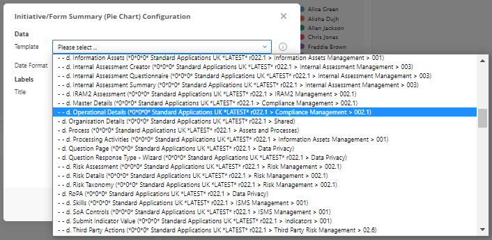
So as seen above, I want to report on "d. Operational Details".
Once you have determined the template you wish to report on, you next need to create the portlet, as detailed in our article on Creating a Portlet selecting "Initiative/Form Summary (Pie Chart)".
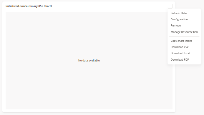
Once created, click on the ellipses in the top right-hand corner of the portlet, followed by "Configuration":
Recalling the template name determined above, you need to select this name from the Template drop-down - this list is in alpha-numerical order. Once the template has been selected, further configuration fields will appear:
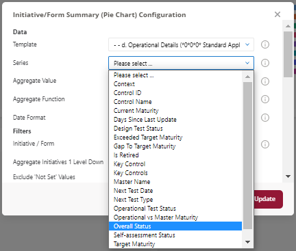
To select the data point you wish to report on, you need to select this from the Series drop-down. In our example, this will be "Overall Status":
If you only select this field and click Update, the data will then show in your pie chart:
Filtering the Data
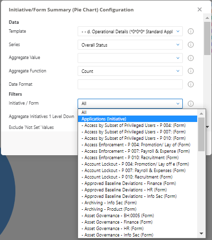
Within a pie chart, you can also filter on what it reports on. For example, if there are multiple sets of operational controls for different business entities, you can filter the chart to only report on that one form. You do so by selecting the form in the Initiatives / Form drop-down - this is an alpha-numeric list of all forms built out from the template, and the initiatives these are within:
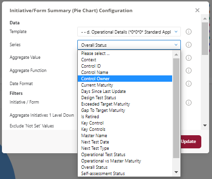
You may also want to filter based on specific items of data on the form - for example, a specific control owner. You can do this via the Filter field. First, you need to check the name of the field - this is easiest done via checking the Series drop-down:
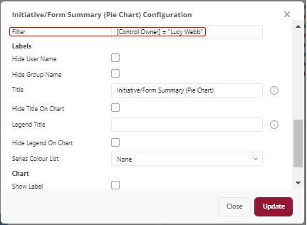
Once you have determined the field's name, you enter the condition - more detail on how these are written can be seen in our article on Report Filters. In our case, I want to see all controls owned by "Jamie Coster" - hence my filter will be [Control Owner] = "Lucy Webb":

Customisation
You can change areas of the pie chart which will change the look and feel of how a pie chart displays to you.
Titles
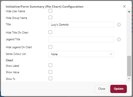
Both the overall pie chart, as well as the legend, may be given names as defined by the user in the Title and Legend Title fields. By default, pie charts will have the title "Initiative/Form Summary (Pie Chart)", with no title attached to the legend.
Series Colour
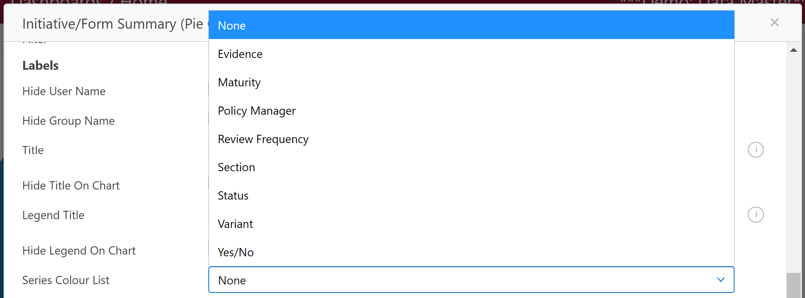
If the colours of the pie chart are not adhering to a particular colour scheme, you can select it do so by select an option list present in the form from the Series Colour List field.
Show Values
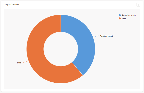
You can also choose to change how the data displays, by choosing to Show Label:

You can also Show Value:


You can also Show %:

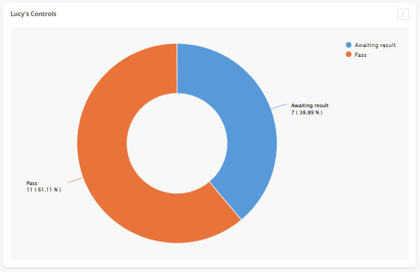
Each of these options can be done simultaneously, as shown.
Comments