The ability to summarise data in a clean manner is key to quick analysis and reporting. However, organisations often struggle with choosing the best method of displaying data sets. SureCloud has many portlet types to be included in dashboards with a wealth of customisability, but sometimes this can lead to confusion as to what portlet is most suitable, and choosing the wrong visual aid can lead to confusion and ambiguity amongst stakeholders.
SureCloud has many graph types, the following are most frequently used:
- Bar (see here for the different types of chart that fall under the bar portlet)
- Grid
- Pie
- Multi-series chart
The best presentation types can be split into two categories: Comparison and Composition.
Comparison
Use these types of portlet to compare one or many values:
- Grid
- Pie
- Bar
- Bar (line)
- Multi series chart
Composition
Use these types of chart to show how individual parts make up a whole, such as showing the number of critical risks in your organisation compared to high, medium, low and negligible.
- Grid
- Pie
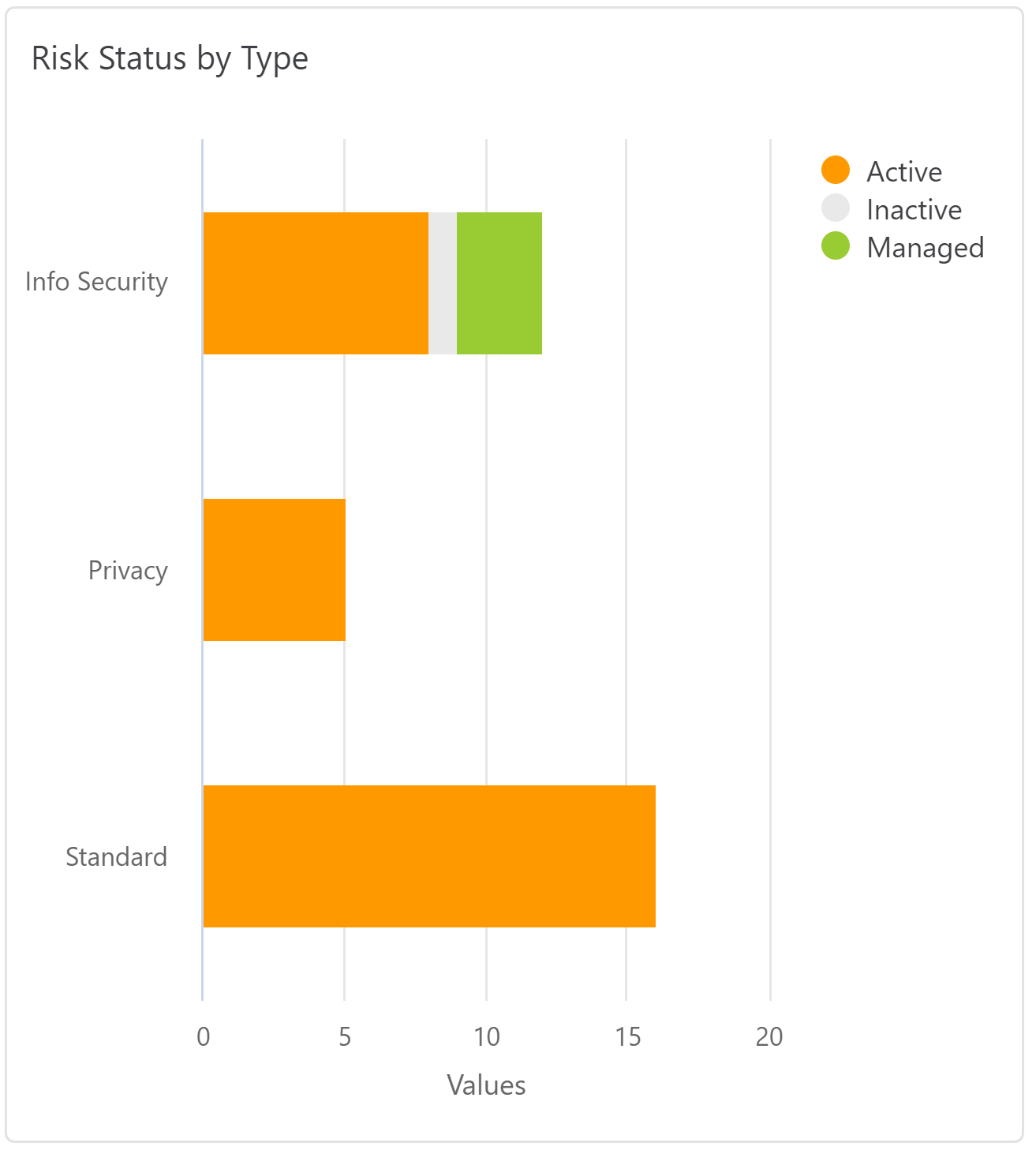
- Bar (stacked)
- Bar (area)
Types of Portlet
Bar
The bar portlets offer many different types of chart to display, including stacked, line and area. Line is useful for comparison and stacked and area are useful for composition. The following design practices hold true for all.
Best Design Practices
- Use horizontal labels to improve readability.
- Don't display more than five categories to avoid clutter.
- Use contrasting colours to easily distinguish between categories.
Grid
This portlet allows data to be summarised quickly in a grid format without the need to navigate to a particular form. For example, a view of the number of risks falling under a particular risk rating within a risk register. One drawback of displaying data in this way is that the visual aid can be less helpful than than that of a bar chart.
Pie
A pie chart is perfect for showing how a category represents part of a whole and comparing two categories, making it useful for both comparison and composition.
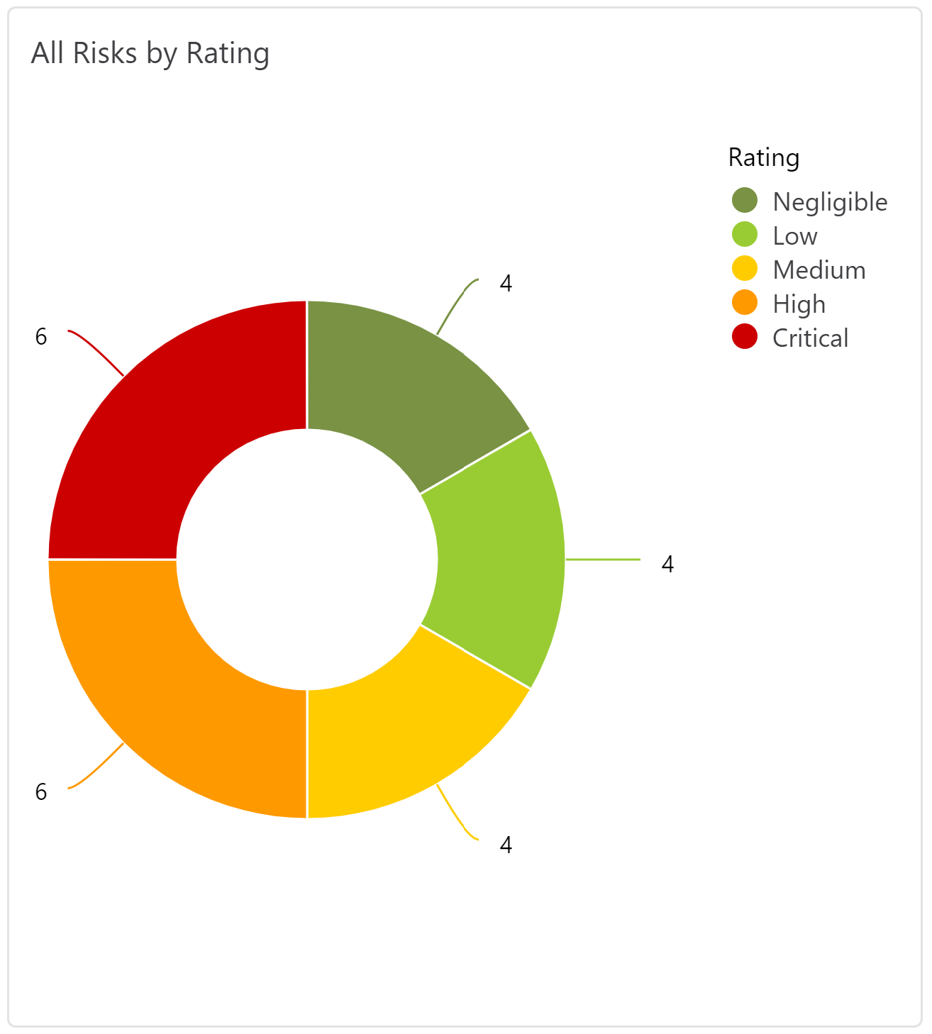
Best Design Practices
- Don't include too many categories, a pie chart is only useful when it is easy to distinguish between categories. Using five as a maximum is a good rule of thumb.
- Avoid using pie charts if the categories have small variations in their size: it's very difficult to quickly tell the difference between two categories that are only different in size by a couple of percent.
Multi Series Chart
A multi series chart is suitable for comparing different data from one category, such as comparing the target, residual and inherent risk of risks from a risk register, as shown below.
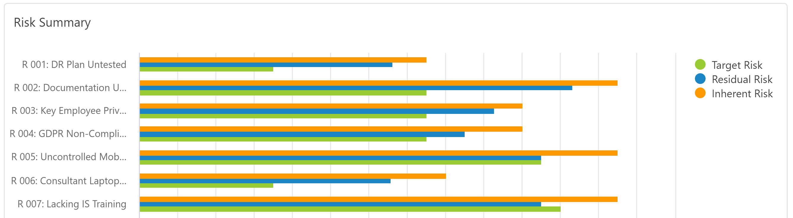
Best Design Practices
- Use horizontal labels to improve readability.
- Avoid using too many data points for one category to avoid clutter, three to four is usually a good rule of thumb for a maximum.
Comments